LATEST POSTS

Every Marvel Easter Egg in ‘Punisher: One Last Kill’
Welcome back, Frank — here are all the secrets you missed.

‘Ahsoka’ Finally Sets Season 2 Return Date
The show is coming back to Disney+ after more than three years.

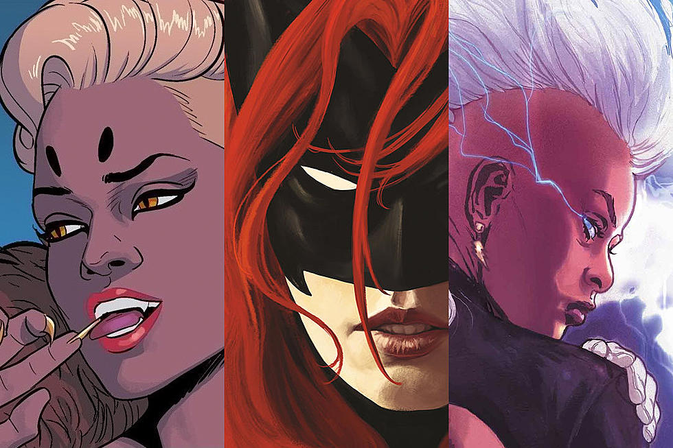
The Worst MCU Costumes Ever
These characters did not live up to their comic-book counterparts.

‘Daredevil: Born Again’ Season 2 Finale Breakdown
What those huge twists mean for Season 3 and the future of the Marvel Cinematic Universe.

A Big Marvel Hero Returned on ‘Daredevil: Born Again’ Finale
Look who’s back in the Marvel Cinematic Universe...

I Ate the Burger King’s Mandalorian Menu
This is the way (to indigestion).

Rare, 2-Hour-Plus ‘Gremlins’ Cut Secretly Screens
The previously never-before-seen cut notably omits Phoebe Cates’ infamous Christmas speech.

‘Avengers: Endgame’ Doesn't Work Without This One Scene
People don’t talk about it, but this one moment is the key to the MCU’s ongoing success.

I Tried Star Wars Blue Milk
May the 4th Be With You! And also with your refrigerator, which can now be stocked with Luke Skywalker’s favorite drink.

Evangeline Lilly to Disney: ‘Shame On You’ for Marvel Layoffs
The MCU star is not happy that Marvel laid off most of its visual development team.

Is DC Still Making ‘The Authority’ Movie?
The movie adaptation based on the DC Comics superhero team was first announced by James Gunn and Peter Safran in 2023.

Gerry Conway, Marvel and DC Writer, Dies at 73
The comic book world has lost one of its most important creators. Gerry Conway, who helped create iconic characters for both Marvel and DC Comics — including the Punisher, Jason Todd, and Firestorm — and wrote memorable runs of many of the biggest characters at both companies, has died. He was 73 years old....

How ‘Endgame’s Ending Creates Dr. Doom
We think we know what they are adding to the film.

Every DC Easter Egg in the ‘Clayface’ Trailer
Deep cut Batman fans: Your moment has come.

The Scariest DC Comics Movie? ‘Clayface’ Debuts First Trailer
The Batman villain gets his own creepy movie trailer.

Burger King Announces New ‘Mandalorian and Grogu’ Menu
It’s a feast fit for an intergalactic bounty hunter.