LATEST POSTS

Marvel Comic-Con 2026 Announcements
Everything Marvel Studios just revealed from Hall H in San Diego.

Marvel Announces ‘Black Panther 3’ at Comic-Con
Wakanda may not be forever. But it will be around for at least one more movie.
As part of their big Comic-Con panel in Hall H in San Diego, Marvel announced that there will be a third Black Panther movie as part of the next era of the Marvel Cinematic Universe. Dav...

Ryan Gosling Will Star in Marvel’s ‘Ghost Rider’
Shawn Levy will direct the new film, scheduled for 2028.

New ‘Lanterns’ Trailer Reveals the Show’s Huge Cosmic Twist
This show was not as simple as it looked.

‘Raiders of the Lost Ark’ Is Getting a Sequel
Marvel is bringing Indiana Jones back to comics for the first time in years.

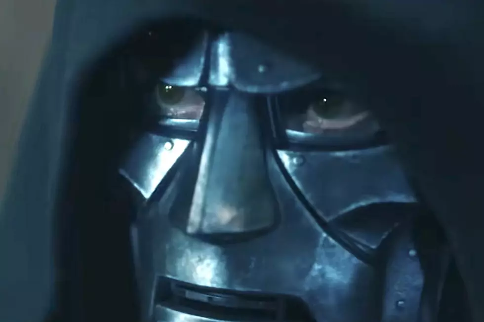
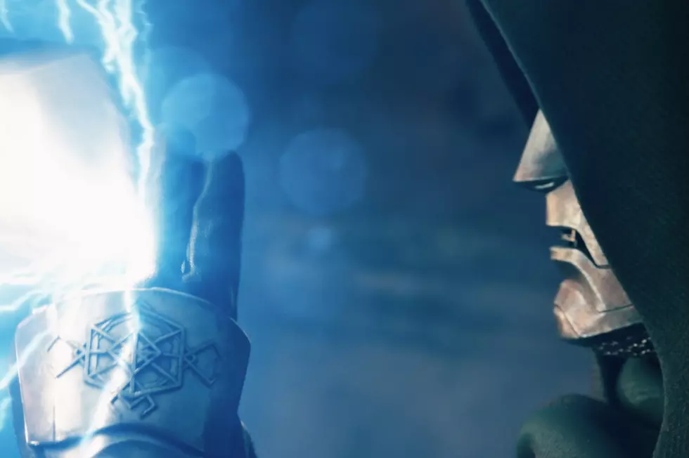
Even More ‘Avengers: Doomsday’ Trailer Easter Eggs & Secrets
This trailer has a lot of surprises that even we didn’t notice at first.

A Lost Star Wars Show Is Going to Be Shown For the First Time
After a long Detour, a show that Disney shelved is going to be seen.

How Did Steve Rogers Return for ‘Avengers: Doomsday’?
Didn’t Steve Rogers retire? Didn’t he get old? What gives?

‘Clayface’ Trailer Puts a Batman Villain in the Spotlight
The classic DC baddie is now the star of his own horror movie.

‘Brand New Day’ Final Trailer Swings Through Spidey History
The new film is definitely a sequel to the events of ‘No Way Home.’

Ryan Reynolds Says Another Deadpool Movie Is Coming
“It’s going to be great.”
Every ‘Avengers: Doomsday’ Trailer Easter Egg and Secret
Did you spot these Marvel references?

New on Disney+ and Hulu in August 2026
The X-Men, Camp Rock 3, Sofia the First, and more.
‘Avengers: Doomsday’ Debuts New Trailer and Poster
Tickets are on sale now for Marvel’s big Avengers crossover.

The New ‘Doomsday’ Poster Has Secrets Nobody Noticed
Did you spot these hidden Easter eggs? They could be huge.

‘The Batman Part 2’ Delayed to 2028
It’s already been almost four years since the previous film.