LATEST POSTS
Who Is Bastion? ‘X-Men ’97’s New Villain, Explained
Uncover the mysterious character from ‘X-Men 97.’
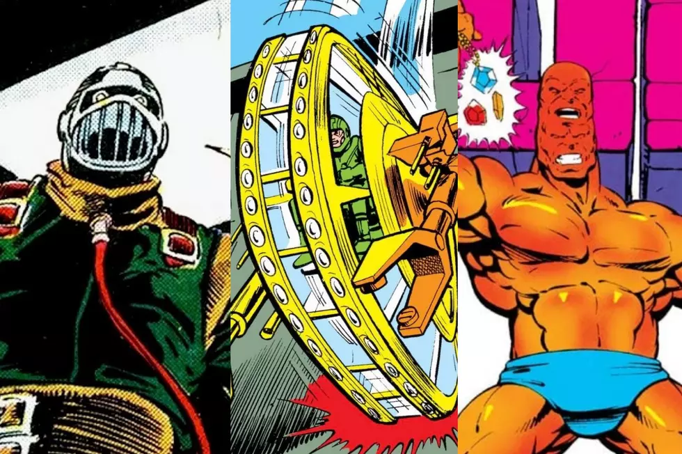
The Worst Marvel Characters Ever
Discover the 30 weirdest Marvel characters ever.

Is ‘Thunderbolts*’ Secretly a ‘Dark Avengers’ Movie?
Uncover the mystery behind Marvel's Thunderbolts* movie title change and the possibility of it being a Dark Avengers movie in disguise.

‘X-Men ’97’ Episode 7: All the Easter Eggs You Missed
Discover the hidden Marvel gems in the latest ‘X-Men 97’ episode, including a surprise cameo and nods to ‘Marvel vs. Capcom.’

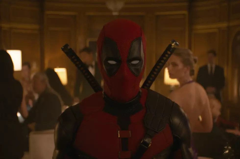
‘Deadpool & Wolverine’ Trailer: All Our Unanswered Questions
Delve into the intriguing ‘Deadpool & Wolverine’ trailer.

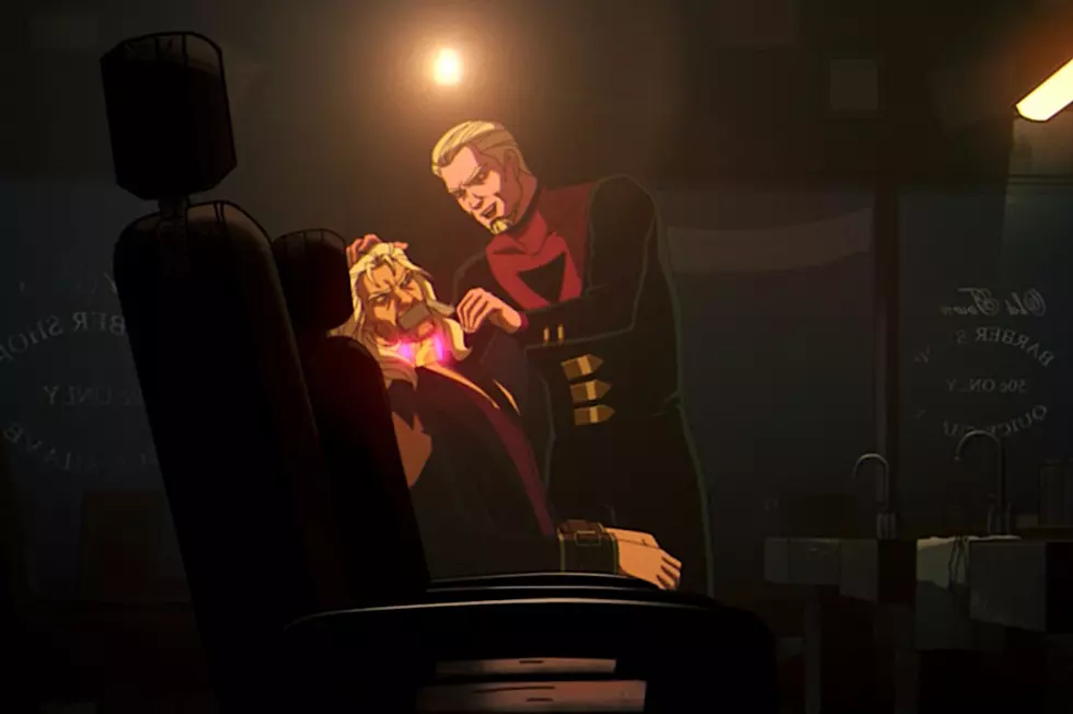
Deadpool & Wolverine Trailer Easter Eggs: The Secrets You Missed
There are a ton of deep cut Marvel references in the new Deadpool trailer — and we found them all.
How ‘X-Men ’97’ Connects to the MCU
Obviously X-Men ’97 is a continuation of X-Men: The Animated Series from the 1990s, which existed more than a decade before the actual start of the Marvel Cinematic Universe in 2008’s Iron Man. It clearly takes place in its own animated X-Men universe.
But the longer this season of X-Men ’...
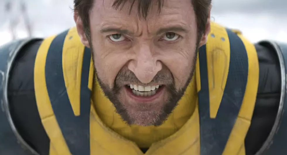
The New ‘Deadpool & Wolverine’ Trailer Is R-Rated Insanity
Hugh Jackman finally dons Wolverine’s signature duds for the new Marvel team-up movie, coming to theaters this summer.

The Best Movies on Tubi Right Now
Explore Tubi, the ad-supported streaming platform, known for its expanding library of films spanning nearly a century.
‘X-Men ’97’ Episode 6: Every Easter Egg You Missed
Uncover a treasure trove of Easter eggs and nods in the newest 'XMen 97' installment.

Why ‘Eternals’ Should Have Been a Show Instead of a Movie
Marvel’s biggest misfire could have been its biggest TV hit.
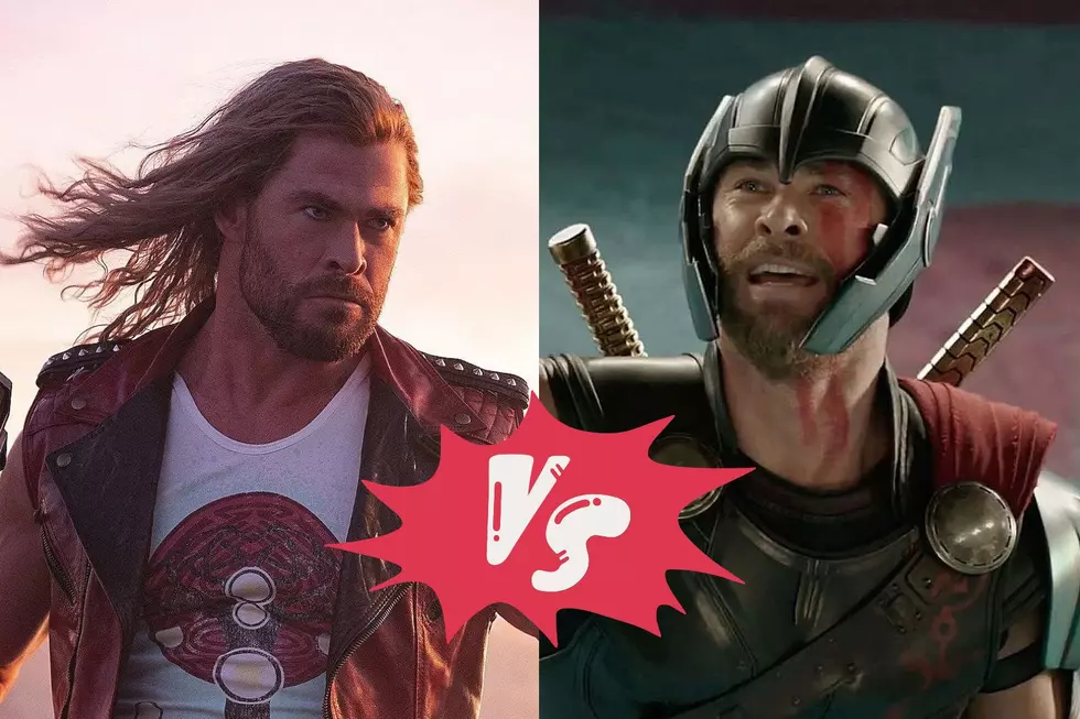
Why ‘Thor: Love and Thunder’ Was Worse Than ‘Ragnarok’
Here’s where the latest Marvel ‘Thor’ movie went wrong.
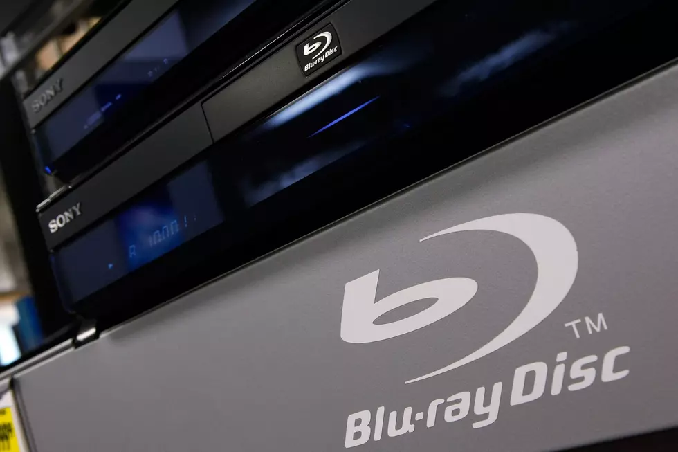
25 Blu-rays That Are Still Worth A Shocking Amount of Money
Uncover the hidden treasures in the world of physical media.

Marvel’s ‘Thunderbolts’ Gets a New Title
Fans and experts speculate on the implications of the asterisk added to Marvel's Thunderbolts title.
‘Deadpool & Wolverine’ CinemaCon Footage Breakdown
Discover exclusive insights from Marvel's upcoming projects

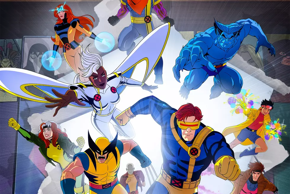
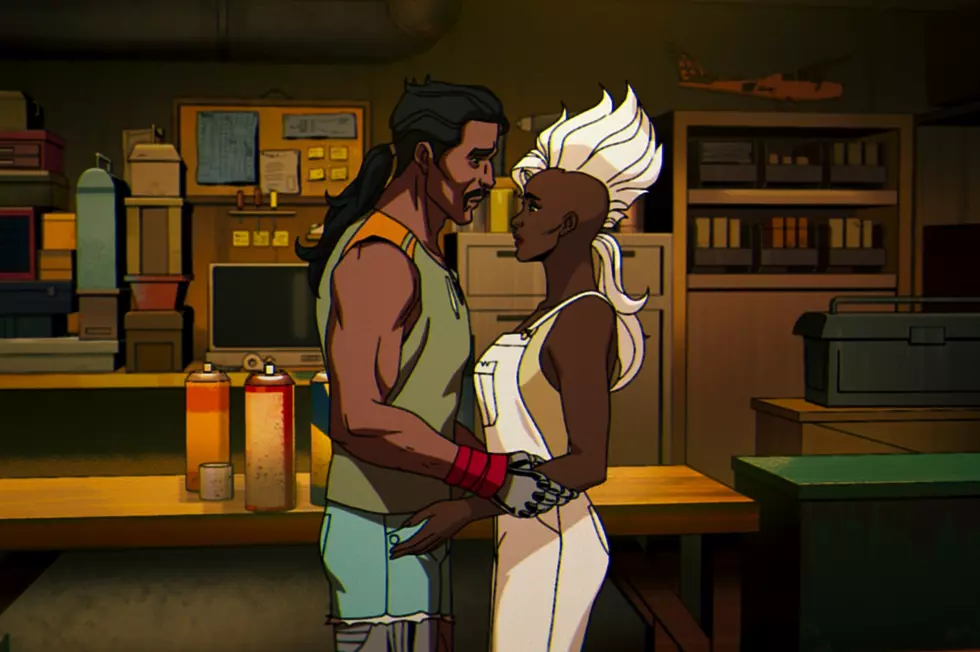
New ‘X-Men ’97’ Teases the Return of a Major Marvel Character
This season of the hit animated Marvel series is only going to get bigger and bigger.