LATEST POSTS

How to Get Into ‘Star Trek’: A Full Franchise Introduction
Want to boldly go into this great franchise? Here’s where to start and what to watch.

Great Directors Who Were Nominated For Razzies
The best directors? Not according to the Golden Raspberry Awards.

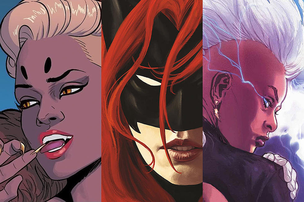
Why Movie Posters Suck Now
Things have changed in the world of movie advertising, and not for the better.

James Gunn Reveals First Look at Lex Luthor Warsuit
A famous piece of DC history comes to live action in ‘Man of Tomorrow.’

Did Marvel Reveal How ‘Avengers: Doomsday’ Ends?
Did He Who Remains win after all?

‘X-Men ’97’ Season 2: Every Easter Egg in the New Trailer
To me, my X-Men Easter eggs!

‘X-Men ’97’ Returns With First Season 2 Trailer
To me, my ’90s X-Men!

‘Mandalorian’ Grosses Less Than ‘Solo’ Over Its Opening Weekend
The film has a shot at becoming the lowest-grossing ‘Star Wars’ in history.

Every Star Wars Film Ranked From Worst to Best
What’s #1? And most importantly: What’s #13?

‘The Mandalorian’ Earned Less On Opening Day Than ‘Solo’
The latest ‘Star Wars’ movie has an uphill climb to becoming a major blockbuster.

A Brutally Honest Kid Reviews ‘The Mandalorian and Grogu’
What do kids really think of the new ‘Star Wars’ movie? We asked an eight-year-old to give us their opinion.

‘The Mandalorian and Grogu’ Review: A Big TV Show in a Theater
The new ‘Star Wars’ movie is an easy to watch, easy to understand version of the hit Disney+ series.

Everything You Need to Know Before ‘The Mandalorian and Grogu’
Here’s the full franchise recap to date.

‘The Batman Part II’ Adds a Slew of New Stars
Sebastian Stan, Scarlett Johansson, and more are coming to Gotham City according to director Matt Reeves.

The First ‘Mandalorian and Grogu’ Reviews Are Here
Is this the way a TV show becomes a blockbuster?

Marvel Fans Call Out ‘Punisher’ Special For Bad Special Effects
One shot in particular is going viral online.